How to Create Pareto Visualization with SQL and Grafana
In this guide, you will learn how to quickly create a Pareto chart using measurement data stored in an SQL database and visualize it in Grafana. We will use concepts from dimensional metrology, meaning we will utilize measurement and characteristic data to identify which characteristics are primarily responsible for the most problems, based on the Pareto principle: 20% of the sources cause 80% of the problems.
Prerequisites
- Postgres SQL database
- Grafana or KensoBI
Initial setup
To keep things very simple, let's use the following Docker Compose file to set up everything we need.
To run it, you can use Windows PowerShell:
docker-compose up -d
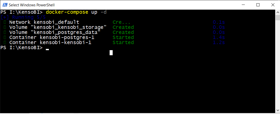
Next, open your web browser and enter: localhost:3000. On the login screen, type admin/admin.
Add data source
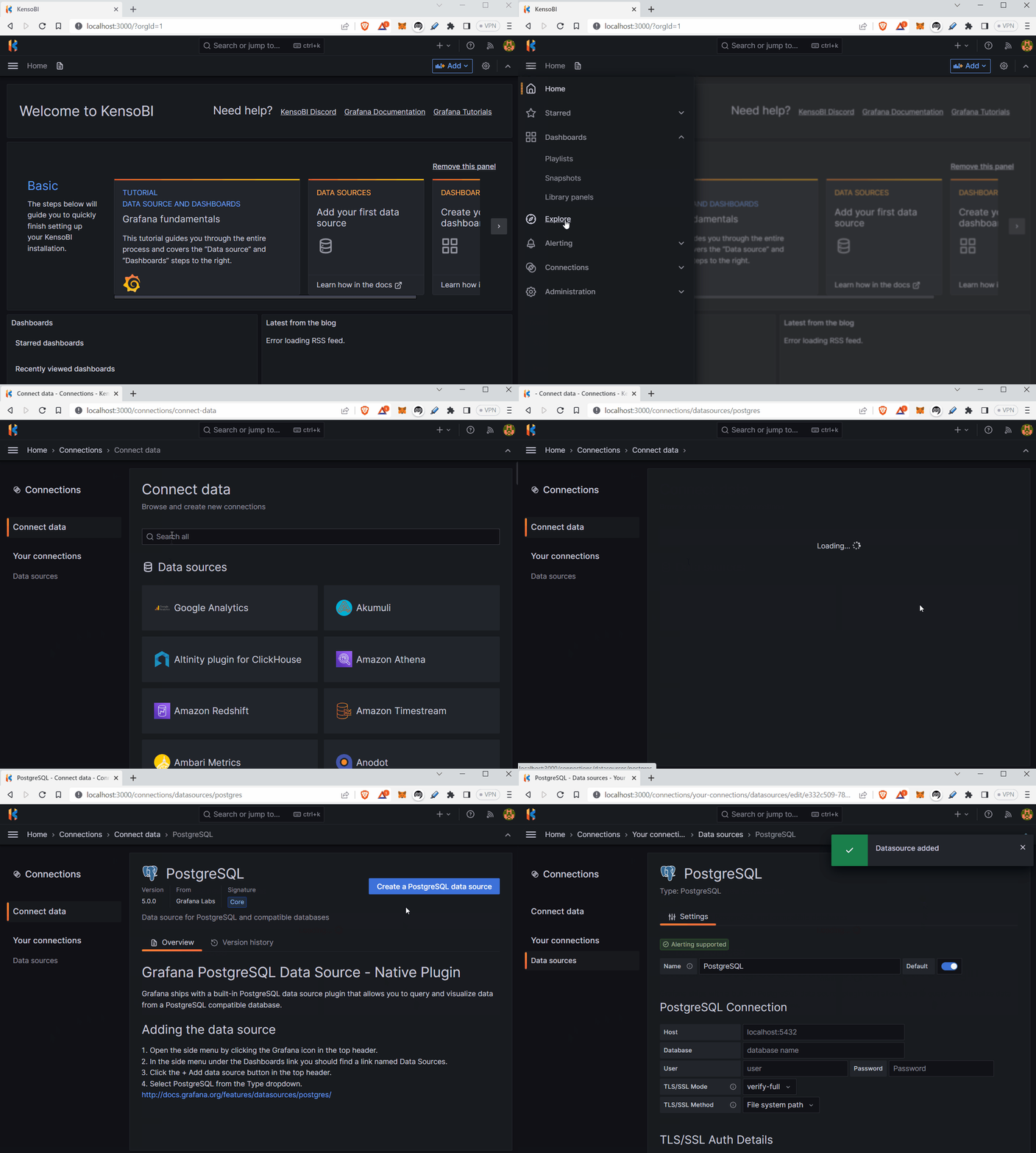
Navigate to Administration -> Data Sources and click on Add New Data Source. Choose PostgreSQL and enter the following information and press Save and test button.
Host: host.docker.internal:5432
Database: kensobi
User: kensobi
Password: kensobiuser
TLS/SSL Mode: disable
Version: 15
Add Pareto Panel
Go to Administration -> Plugins and search for Pareto and click install.

Generate sample data
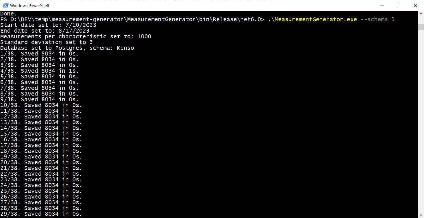
To create measurements, execute our measurement generator. You can locate it at https://github.com/KensoBI/measurement-generator. You have the option to download the pre-built binaries or compile it on your own.
Run the generator with the provided parameters:
.\MeasurementGenerator.exe --schema 1
Creating a New Dashboard
Begin by creating a new dashboard.
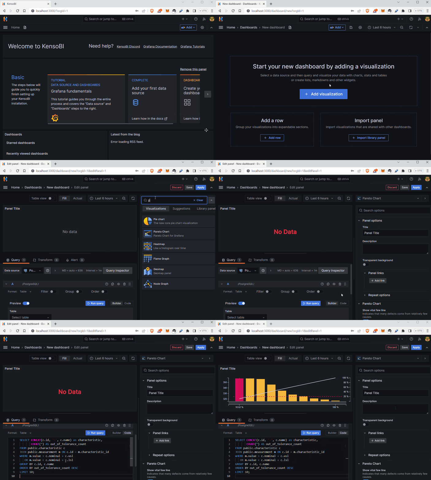
Select the Pareto panel and choose the PostgreSQL data source. In the data source settings, switch to Code view and input the following query:
SELECT CONCAT(c.id, '-', c.name) as characteristic,
       COUNT(*) AS out_of_tolerance_count
FROM public.characteristic c
JOIN public.measurement m ON c.id = m.characteristic_id
WHERE m.value > c.nominal + c.usl
   OR m.value < c.nominal + c.lsl
GROUP BY c.id, c.name
ORDER BY out_of_tolerance_count DESC
LIMIT 10;
To add dynamism to the chart, include time filter variable to factor in the selected date.
SELECT CONCAT(c.id, '-', c.name) as characteristic,
       COUNT(*) AS out_of_tolerance_count
FROM public.characteristic c
JOIN public.measurement m ON c.id = m.characteristic_id
WHERE (m.value > c.nominal + c.usl
   OR m.value < c.nominal + c.lsl)
AND $__timeFilter(m.time)
GROUP BY c.id, c.name
ORDER BY out_of_tolerance_count DESC
LIMIT 10
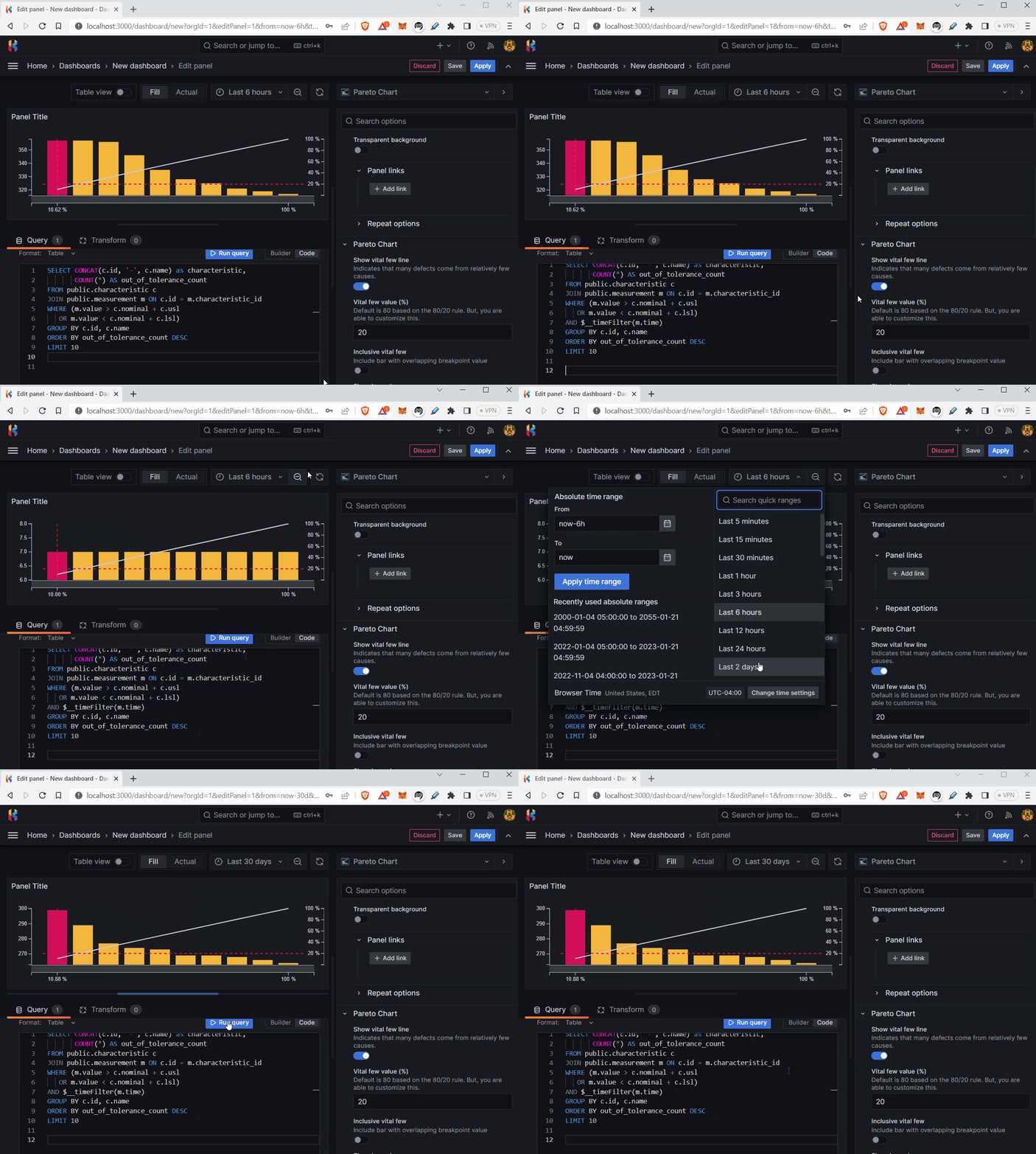
This is it. Our Pareto chart is complete!


