How to build a 3D SPC dashboard with KensoBI
Mean monitoring or control charting in Statistical Process Control (SPC) is used to monitor trends or shifts in the manufacturing process. It helps to understand anomalies and define the typical production process variation (natural process variation or common cause).
In this guide, you will learn how to create an SPC dashboard to monitor the continuous manufacturing process. You will see how to calculate common SPC indicators using SQL and how to customize balloon’s views to create a unique experience for your users.
Tools needed:
- Any SQL database. We will use free and open-source PostgreSQL.
- Database schema from Q-DAS - popular statistical software. You can download SQL scripts for the schema from Q-DAS’ website.
- KensoBI. Sign up for your free cloud account at https://cloud.kensobi.com/signup.
- Download and import dashboard from the previous article.
We will be extending the dashboard we build in our previous blog post. If you already have it, open it, go to dashboard settings and click Save As to save it under a different name.
Note: when you re-import the same dashboard, you will be required to change UUID - just add or remove a letter to make it unique.

SPC calculations in SQL
We need to expand our existing database query to calculate some common SPC indicators. Navigate to the Queries tab and replace query A with the following:
--calculate SPC indicators
SELECT
	substring(memerknr from '(.*)\[') as feature,
	substring(memerknr from '\[(.*)\]') as control,
	'point' as featuretype,
	Menennmas as value,
	Meugw as lsl,
  	Meogw as usl,
	avg(sampleMean) as grandMean,
	max(sampleMean)-min(sampleMean) as range,
	min(sampleMean) as min,
	max(sampleMean) as max,
	stddev_pop(sampleMean) as stdDev,
	avg(sampleMean) + (0.577 * (max(sampleMean)-min(sampleMean))) as ucl,
	avg(sampleMean) - (0.577 * (max(sampleMean)-min(sampleMean))) as lcl,
	(Meogw - Meugw)/(6*stddev_pop(sampleMean)) as cp,
	LEAST (((Menennmas + Meogw) - avg(sampleMean))/(3*stddev_pop(sampleMean)),
		   (avg(sampleMean) - (Menennmas + Meugw))/(3*stddev_pop(sampleMean))) as cpk
FROM(
	--3) calculate sample mean for each characteristic
	SELECT
		characteristicId,
		avg(measurementValue) as sampleMean,
		sampleNumber
	FROM(
		-- 2) group measurements for each characteristic in samples size of 5
		SELECT
			w.wvmerkmal as characteristicId,
			w.wvwert measurementValue,
			wvdatzeit as measurementDate,
			(row_number() OVER (PARTITION BY wvmerkmal
            					ORDER BY wvmerkmal,
                                wvdatzeit DESC) - 1) / 5 AS sampleNumber
		FROM
			wertevar w
		WHERE
			w.wvteil = 1
			-- 1) filter only X,Y and Z characteristics for part 1
			AND w.wvmerkmal in (SELECT memerkmal FROM merkmal WHERE
            					meteil = 1
								AND memerknr like '%[x]'
                                OR memerknr like '%[y]'
                                OR memerknr like '%[z]')
			AND $__timeFilter(wvdatzeit)
	) means
	GROUP BY
		sampleNumber,
		characteristicId
) sampleMeans, merkmal characteristic
WHERE
	sampleMeans.characteristicId = characteristic.memerkmal
GROUP BY
	 memerknr, Menennmas, Meugw, Meogw
Ok, this might look wild at first glance. No worries. Let’s go over what is happening here.
- This is a simple performance trick to filter this massive measurement table quickly. In this example, we will focus only on in X, Y, and Z characteristics of part with ID=1.
- This statement filters measurements and groups them into samples of size 5.
- Calculate the sample mean for each characteristic
- Calculate SPC indicators:
- Grand mean
- Range
- Minimum
- Maximum
- Standard Deviation
- Lower Control Limit (LCL)
- Upper Control Limit (UCL)
- Process Capability (Cp)
- Process Capability Index (Cpk)
Balloon chart data
Our balloon charts should display sample means instead of raw measurement values. Let’s reuse query A. We only need a sample mean for each characteristic so remove all other calculations. Paste in following SQL in query B and change Format As dropdown to table.
SELECT
	substring(memerknr from '(.*)\[') as feature,
	substring(memerknr from '\[(.*)\]') as control,
	sampleMean,
	sampleNumber +1 as sampleNumber
FROM(
	--calculate mean of each sample
	SELECT
		characteristicId,
		avg(measurementValue) as sampleMean,
		sampleNumber
	FROM(
		-- group measurements for each characteristic in samples size of 5
		SELECT
			w.wvmerkmal as characteristicId,
			w.wvwert measurementValue,
			wvdatzeit as measurementDate,
			(row_number() OVER (PARTITION BY wvmerkmal
            					ORDER BY wvmerkmal,
                                wvdatzeit DESC) - 1) / 5 AS sampleNumber
		FROM
			wertevar w
		WHERE
			w.wvteil = 1
			-- 1) filter only X,Y and Z characteristics for part 1
			AND w.wvmerkmal in (SELECT memerkmal FROM merkmal WHERE
            					meteil = 1
								AND memerknr like '%[x]'
                                OR memerknr like '%[y]'
                                OR memerknr like '%[z]')
			AND $__timeFilter(wvdatzeit)
	) means
	GROUP BY
		sampleNumber,
		characteristicId
) sampleMeans, merkmal characteristic
WHERE
	sampleMeans.characteristicId = characteristic.MEMERKMAL
View groups
Switch to the Visualization tab, select Point template in Balloon Settings, scroll down to Balloon Views, and click on Add button to add a new view. Enter the following settings:

First column with value X should be set to static value. Set other cells to type Number and decimals 2.
Create another table view called X bottom:

And another one:

Switch to X view. Scroll down to Graph Axes section and change decimals to 2 in Left Y settings. Next, in X-Axis change:
Mode: Data series
X column: sampleNumber
Y column: sampleMean
In Graph Thresholds, add lines for grand mean, UCL and LCL.
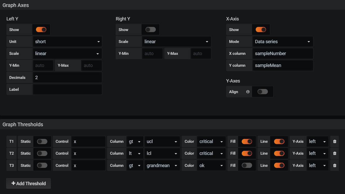
Exit edit mode and resize balloon with X characteristic, so both tables and chart are visible. We made a lot of changes, so let’s save the current dashboard.
Conditional styling
A proper monitoring dashboard has to include color highlighting to spot indicators requiring attention quickly. KensoBI can dynamically change balloon colors, and individual table cells based on values returned from the database.
We want to turn balloon, label, and 3D feature red when Cp and Cpk for X, Y, or Z go below our limit. To do this, go back to editor, select Point template, and press the +Add Color Mapping button.
Add mapping for each control and characteristic.
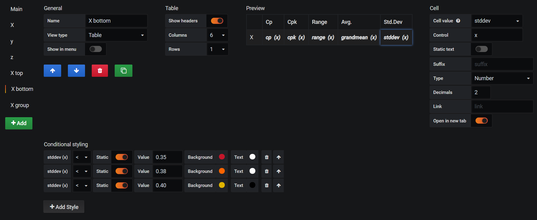
The last step is to add conditional formatting to individual values in the balloon table. Scroll down to the Balloon Views section and then select X bottom view. Click on the Cp column, then Add Style button. Change = to < and set value to the desired limit. Repeat for Cpk and standard deviation.
Now, let’s duplicate it for Y and Z characteristics. Select each view, press the green clone button and change the control value.
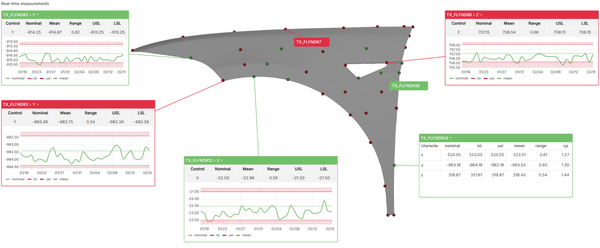
Congratulations! Your SPC dashboard is ready!
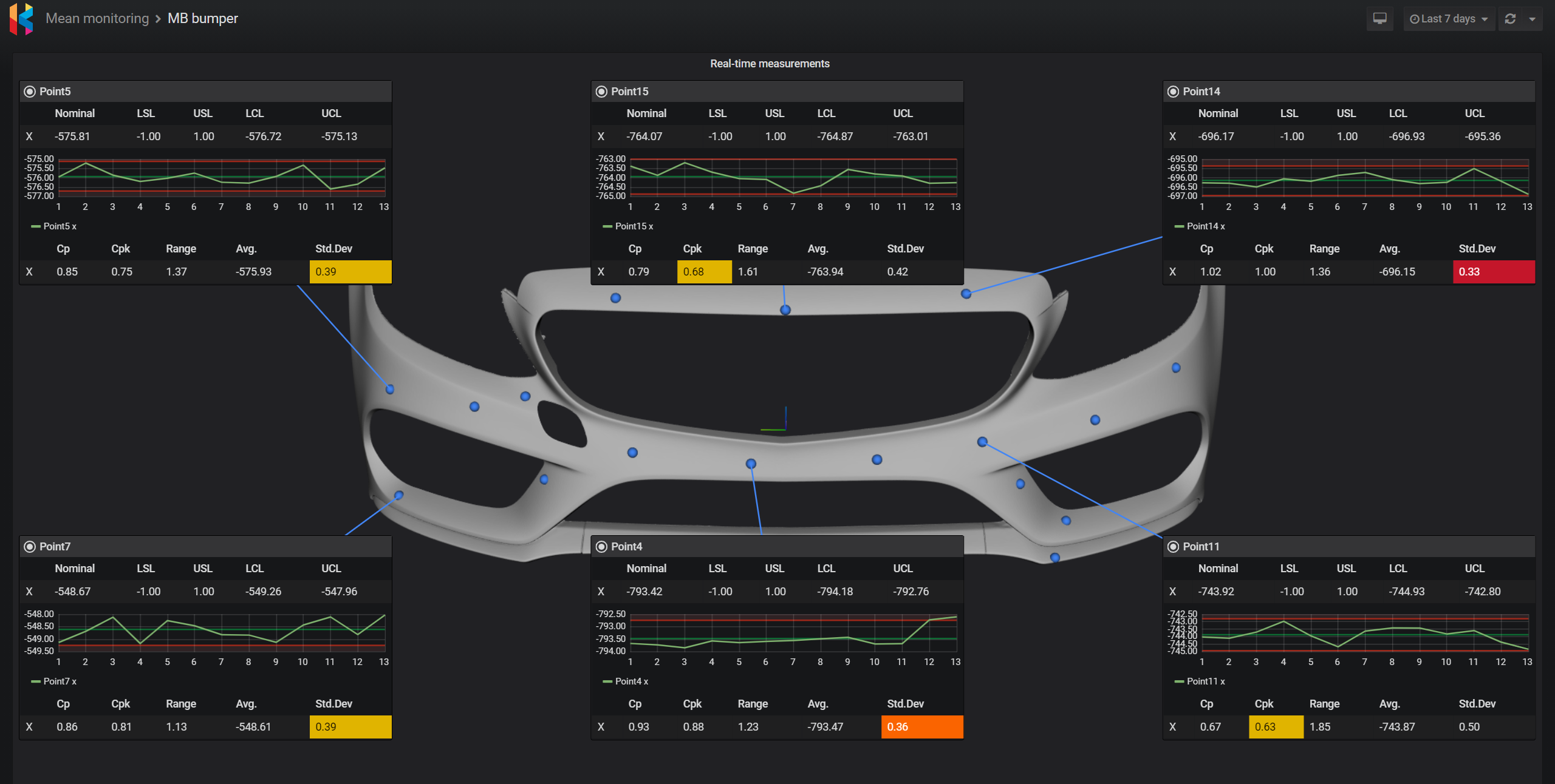
You can download the latest version of this dashboard from our demo instance. Send us a message if you need an account.


