How to create an X-bar R control charts with SQL
In this tutorial, you will learn how to create an X-bar R charts using SQL commands. This is the first guide in a series that will show you how to create various control charts using SQL so you can easily visualize them in business intelligence (BI) tools like KensoBI/Grafana, QlikView, or PowerBI.
Queries are designed to be “variable-friendly”, meaning you will be able to add variables from your BI tool and dynamically control things like date ranges, sample size, or last number of measurements. The SQL queries below were built and tested on the PostgreSQL database but will work on any rational database with very small tweaks.
Before diving into the code though, it is crucial to understand what X-Bar and R charts are, when to use them and why. Understanding the fundamentals will allow you to build efficient, custom queries that can scale across large volumes of your measurement data.
What is X-bar chart?
The X-bar (x̄ or Xbar) chart is used to monitor the mean of a process where measurements are performed in subgroups on a continuous data flow. Chart generally consists of four lines:
- UCL - Upper Control Limit
- LCL - Lower Control Limit
- X-Bar or x̄ - sample mean
- X-double bar or x̄̄ - grand mean (mean of sample means)
Upper and lower control limits are calculated from the data set, as such, almost all of the data points on the chart will fall within these limits as long as the process remains in control. Data points are ordered by time or by production sequence.
What is R chart?
When working with X-Bar charts, we have to talk about R chart. R chart is used to monitor the variation of a process performed in subgroups on a continuous data flow. It is usually plotted together with the Xbar chart because it essential to correctly interpret the Xbar chart. If the R chart is out of control, then the control limits of the Xbar chart might be wrong.
When to use X-bar R charts?
Use X-bar R charts to assess the stability of a continuous process. Process is stable when both means and variances are constant over time. X-bar chart along R chart will help you identify if variations from subgroup to subgroup in your process come from a common or special cause.

What are the requirements for the X-Bar chart?
- Your data, temperature, weight, length, position, and time, are measured on a continuous basis.
- Your data is normally distributed
- Subgroup size is 2 or more but less than 11
How to interpret X-Bar chart?
If any point in your data set is outside of the calculated control limits (that is, the UCL and LCL), this may be an indication that the process variation is unstable or out of control. Before making any conclusions about the X-bar chart, we first need to look at the R chart and see if it is in control. If the R chart is in control, we can be sure that control limits on the X-bar chart are accurate and we are doing an assessment on the process center.
Sometimes, even if all points fall within X-bar control limits, there could still be a problem with your process. It usually happens when your data points do not look random and start forming a pattern. A good example is if the first five data points out of a set of 20 are above the grand mean, and the final five are below.
Initial SQL setup
Create a sample measurement table and populate it with some measurements.
CREATE TABLE measurements
(
    partid                          int,
    characteristicid                int,
    measurementvalue                float,
    measurementdate                 timestamp
)
We will also need a table with SPC constants. Here are the queries to populate it.
CREATE TABLE spc_constants
(
    subgroup int NOT NULL,
    c4_xbar_sigma float,
    d2_xbar_range float,
    d3_range_limit float,
    a2_xbar_limit_range float,
    a3_xbar_limit_sigma float,
    b3_sigma_lcl float,
    b4_sigma_ucl float,
    d3_range_lcl float,
    d4_range_ucl float,
    CONSTRAINT subgroup_pk PRIMARY KEY (subgroup)
)
Filter and create subgroups
The first thing we need to do is to reduce the number of data points. In this example, we will filter our measurements by part, characteristic, and measurement date. Next, we split the result into sub-groups using the window function. In an X-bar chart, our subgroup should be between 2 and 10. We will go with 5.
SELECT
	measurementValue,
    (row_number() OVER (ORDER BY measurementDate DESC) - 1) / 5 AS subgroup
FROM
	measurements
WHERE
	partId = 1
    AND characteristicId = 1
    AND measurementDate BETWEEN '2020-09-09' AND '2020-09-20'
--ORDER BY measurementDate DESC
--LIMIT 50
We could further reduce the result by limiting it to the last n number of measurements. Don’t forget to order it by date before applying a limit.
Xbar data points
Raw measurement values are now in groups. Let’s average them out to get Xbar values. It could be useful to limit the result set to the last number of samples.
SELECT
	avg(measurementValue) AS subgroupMean,
	(subgroup + 1) AS subgroupNumber
FROM (
	SELECT
		measurementValue,
		(row_number() OVER (ORDER BY measurementDate DESC) - 1) / 5 AS subgroup
	FROM
		measurements
	WHERE
		partId = 1
		AND characteristicId = 1
		AND measurementDate BETWEEN '2020-09-09' AND '2020-09-20'
	--ORDER BY measurementDate DESC
	--LIMIT 50
) subgroups
GROUP BY subgroup
ORDER BY subgroup ASC
--LIMIT 10 -- limit to last number of samples
We can now plot our sample means.
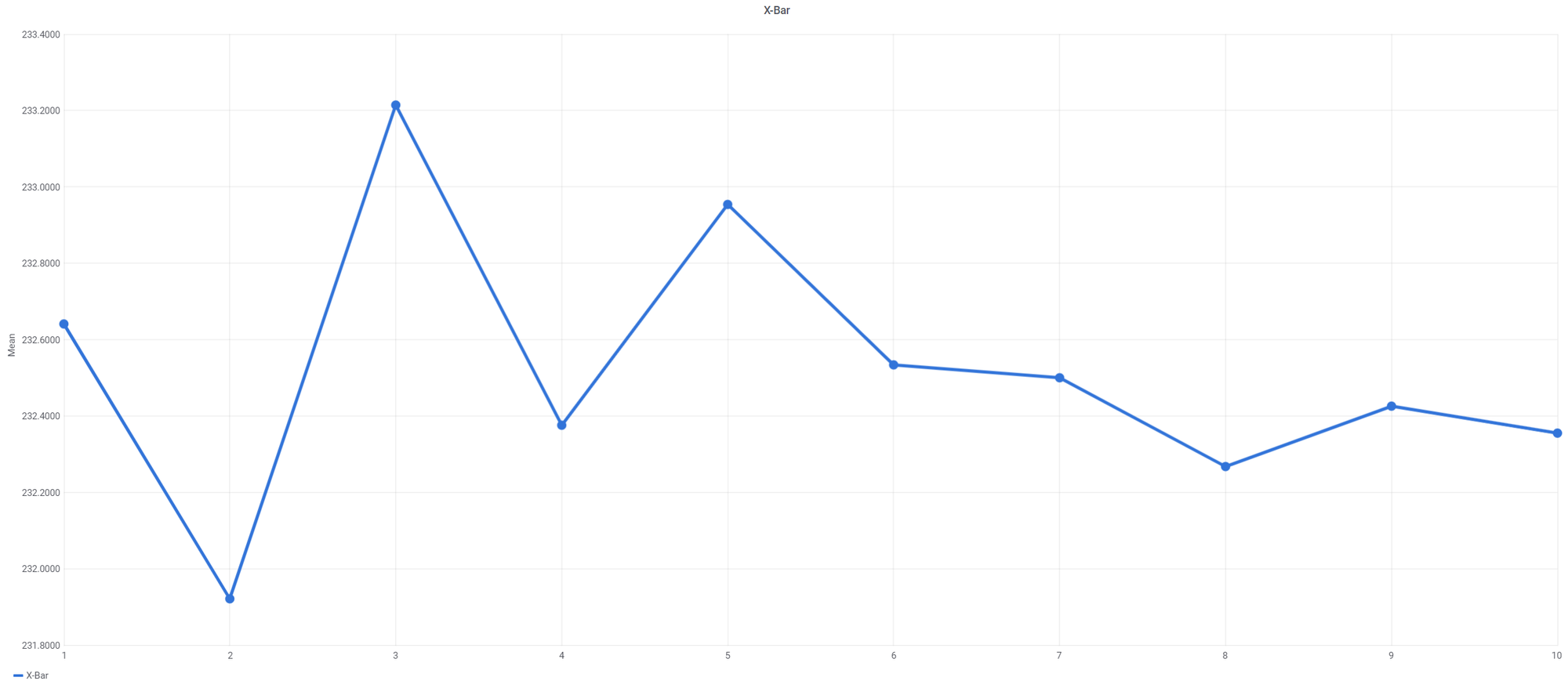
We are missing 3 more lines – UCL, LCL, and grand mean (X-double bar).
Calculate X-double bar
X-double bar is simply an overall mean of all our sample means. Add another SELECT statement and take an average of your X-bar values. This will give us one value that we can plot as a horizontal line.
SELECT
	avg(subgroupMean) as xDoubleBar
FROM
(
	SELECT
		avg(measurementValue) AS subgroupMean,
		(subgroup + 1) AS subgroupNumber
	FROM (
		SELECT
			measurementValue,
			(row_number() OVER (ORDER BY measurementDate DESC) - 1) / 5 AS subgroup
		FROM
			measurements
		WHERE
			partId = 1
			AND characteristicId = 1
			AND measurementDate BETWEEN '2020-09-09' AND '2020-09-20'
		--ORDER BY measurementDate DESC
		--LIMIT 50
	) subgroups
	GROUP BY subgroup
	ORDER BY subgroup ASC
	--LIMIT 10 -- limit to last number of samples
) sampleMeans
Calculate Upper Control Limit (UCL) for Xbar chart
UCL is a line above the X-double bar and represents 3x sigma deviation from the X-double bar.
Modify the previous query and add a range calculation. On top of that, we need to add another SELECT statement to calculate the X-double bar and R-bar (average of ranges).
SELECT
	avg(sampleMean) as xDoubleBar,
	avg(sampleRange) as rbar
FROM
(
	SELECT
		avg(measurementValue) AS sampleMean,
		(subgroupNumber + 1) AS subgroupNumber,
		max(measurementValue) - min(measurementValue) as sampleRange
	FROM (
		SELECT
			measurementValue,
			(row_number() OVER (ORDER BY measurementDate DESC) - 1) / 5 AS subgroupNumber
		FROM
			measurements
		WHERE
			partId = 1
			AND characteristicId = 1
			AND measurementDate BETWEEN '2020-09-09' AND '2020-09-20'
		--ORDER BY measurementDate DESC
		--LIMIT 50
	) subgroups
	GROUP BY subgroupNumber
	ORDER BY subgroupNumber ASC
	--LIMIT 10 -- limit to last number of samples
) sampleMeans
With our data ready, it is time to apply the UCL formula that goes as follows:
UCL = X-double bar + A2 * R-bar
X-double bar is the mean of means. A2 is a constant. We will use our SPC constant reference table to pick A2value from the corresponding sample size and plug it into the formula.
We now have everything we need to calculate the upper control limit. Let’s add another SELECT to the above query.
SELECT
	(xDoubleBar + ((SELECT a2_xbar_limit_range
					FROM spc_constants
                	WHERE subgroup = 5) * rBar)) AS UCL
FROM
(
	SELECT
		avg(sampleMean) as xDoubleBar,
		avg(sampleRange) as rBar
	FROM
	(
		SELECT
			avg(measurementValue) AS sampleMean,
			(subgroupNumber + 1) AS subgroupNumber,
			max(measurementValue) - min(measurementValue) as sampleRange
		FROM (
			SELECT
				measurementValue,
				(row_number() OVER (ORDER BY measurementDate DESC) - 1 / 5)
                AS subgroupNumber
			FROM
				measurements
			WHERE
				partId = 1
				AND characteristicId = 1
				AND measurementDate BETWEEN '2020-09-09' AND '2020-09-20'
			--ORDER BY measurementDate DESC
			--LIMIT 50
		) subgroups
		GROUP BY subgroupNumber
		ORDER BY subgroupNumber ASC
		--LIMIT 10 -- limit to last number of samples
	) sampleMeans
) doubleBar
Calculate Lower Control Limit (LCL) for Xbar chart
Lower Control Limit (LCL) is the same as UCL but with 3x sigma deviation pointing downward. It is represented by a horizontal line below the grand mean. The Lower Control Limit formula goes as follows:
LCL = X-double bar - A2 * R-bar
We can reuse UCL SQL code and just change signs in our formula from + to -.
SELECT
	(xDoubleBar - ((SELECT a2_xbar_limit_range
					FROM spc_constants
                	WHERE subgroup = 5) * rBar)) AS LCL
FROM
(
	SELECT
		avg(sampleMean) as xDoubleBar,
		avg(sampleRange) as rBar
	FROM
	(
		SELECT
			avg(measurementValue) AS sampleMean,
			(subgroupNumber + 1) AS subgroupNumber,
			max(measurementValue) - min(measurementValue) as sampleRange
		FROM (
			SELECT
				measurementValue,
				(row_number() OVER (ORDER BY measurementDate DESC) - 1 / 5)
                AS subgroupNumber
			FROM
				measurements
			WHERE
				partId = 1
				AND characteristicId = 1
				AND measurementDate BETWEEN '2020-09-09' AND '2020-09-20'
			--ORDER BY measurementDate DESC
			--LIMIT 50
		) subgroups
		GROUP BY subgroupNumber
		ORDER BY subgroupNumber ASC
		--LIMIT 10 -- limit to last number of samples
	) sampleMeans
) doubleBar
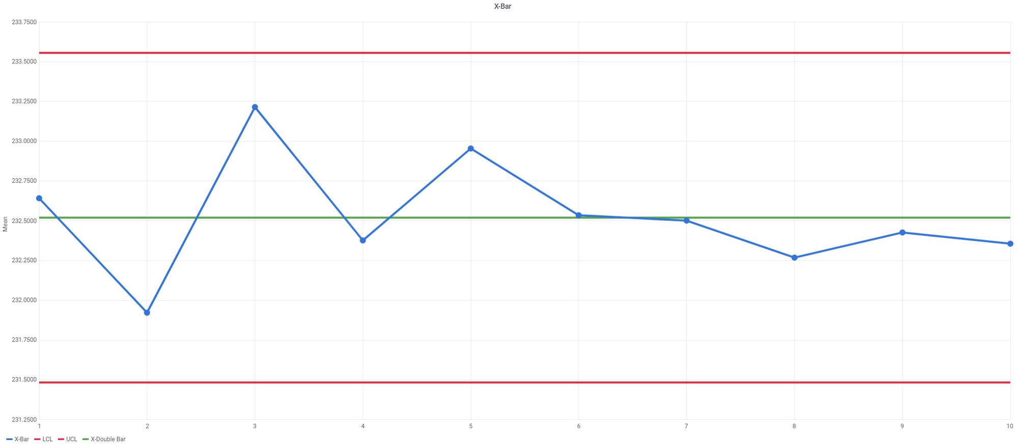
We now have four queries. Each query represents a separate series on a chart. When you load it into the BI tool, your visualization should look like this:
Sample Range for R chart
With our Xbar chart out of the way, let’s focus on R chart. We will reuse most of the queries from Xbar chart and just change means to ranges.
SELECT
	max(measurementValue)-min(measurementValue) as subgroupRange,
	(subgroup + 1) AS subgroupNumber
FROM (
	SELECT
		measurementValue,
		(row_number() OVER (ORDER BY measurementDate DESC) - 1) / 5 AS subgroup
	FROM
		measurements
	WHERE
		partId = 1
		AND characteristicId = 1
		AND measurementDate BETWEEN '2020-09-09' AND '2020-09-20'
	--ORDER BY measurementDate DESC
	--LIMIT 50
) subgroups
GROUP BY subgroup
ORDER BY subgroup ASC
--LIMIT 10 -- limit to last number of samples
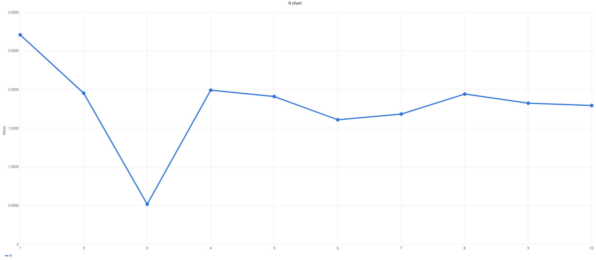
Here is the plotted result:
Calculate R-bar
R-bar is an overall mean of all our sample ranges. Let’s add another SELECT statement and take the average of our sample ranges. This will give use one value that we can plot as horizontal line.
SELECT
	avg(subgroupRange) as rBar
FROM
	(
	SELECT
		max(measurementValue)-min(measurementValue) as subgroupRange,
		(subgroup + 1) AS subgroupNumber
	FROM (
		SELECT
			measurementValue,
			(row_number() OVER (ORDER BY measurementDate DESC) - 1) / 5 AS subgroup
		FROM
			measurements
		WHERE
			partId = 1
			AND characteristicId = 1
			AND measurementDate BETWEEN '2020-09-09' AND '2020-09-20'
		--ORDER BY measurementDate DESC
		--LIMIT 50
	) subgroups
	GROUP BY subgroup
	ORDER BY subgroup ASC
	--LIMIT 10 -- limit to last number of samples
) ranges
Calculate Upper Control Limit (UCL) for R chart
UCL in R chart is a line above the center line and represents 3x sigma deviation from R-bar. The formula is a little different compare to Xbar:
UCL = D4*R-bar
D4 is a constant. We will use our SPC constant reference table to pick D4 value from the corresponding sample size and plug it into the formula.
Let’s add another SELECT to the previous query.
SELECT
  ((SELECT d4_range_ucl FROM spc_constants WHERE subgroup = 5) * rBar) as UCL
FROM
(
	SELECT
		avg(subgroupRange) as rBar
	FROM
		(
		SELECT
			max(measurementValue)-min(measurementValue) as subgroupRange,
			(subgroup + 1) AS subgroupNumber
		FROM (
			SELECT
				measurementValue,
				(row_number() OVER (ORDER BY measurementDate DESC) - 1) / 5 AS subgroup
			FROM
				measurements
			WHERE
				partId = 1
				AND characteristicId = 1
				AND measurementDate BETWEEN '2020-09-09' AND '2020-09-20'
			--ORDER BY measurementDate DESC
			--LIMIT 50
		) subgroups
		GROUP BY subgroup
		ORDER BY subgroup ASC
		--LIMIT 10 -- limit to last number of samples
	) ranges
)rbar
Calculate Lower Control Limit (LCL) for R chart
LCL in R chart is a line below the center line and represents 3x sigma deviation from R-bar pointing downwards. Formula for LCL in R chart goes as follows:
LCL = D3*R-bar
SELECT
  ((SELECT d3_range_lcl FROM spc_constants WHERE subgroup = 5) * rBar) as UCL
FROM
(
	SELECT
		avg(subgroupRange) as rBar
	FROM
		(
		SELECT
			max(measurementValue)-min(measurementValue) as subgroupRange,
			(subgroup + 1) AS subgroupNumber
		FROM (
			SELECT
				measurementValue,
				(row_number() OVER (ORDER BY measurementDate DESC) - 1) / 5 AS subgroup
			FROM
				measurements
			WHERE
				partId = 1
				AND characteristicId = 1
				AND measurementDate BETWEEN '2020-09-09' AND '2020-09-20'
			--ORDER BY measurementDate DESC
			--LIMIT 50
		) subgroups
		GROUP BY subgroup
		ORDER BY subgroup ASC
		--LIMIT 10 -- limit to last number of samples
	) ranges
)rbar
Summary
This completes our X-Bar R guide. When you go and plot the queries it should look close to this:
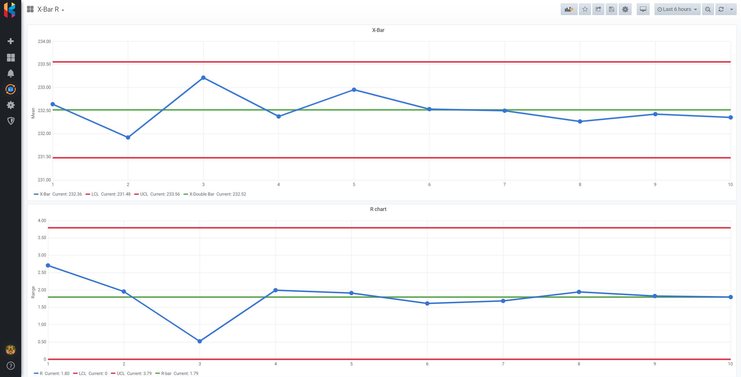
With rather simple SQL code, we were able to develop scripts that allow us to plot X-bar R control charts in your favorite BI tool.
I invite you to check out KensoBI and discover how you can visualize your process in the form of interactive 3D dashboards.


